AN INTERIOR DESIGNER’S 5 FAVORITE PAINT COLORS
AN INTERIOR DESIGNER’S 5 FAVORITE PAINT COLORS
Selecting paint colors is one of those things that feels like it should be so simple when, in fact, it can be incredibly difficult to choose the right color.
To help ease the process of choosing, we are sharing five of our favorite and most-used paint colors. Don’t be afraid to mix and match!
P.S. Did you know I sell instant download paint palettes?! Instant download paint collections for only $8. You really don’t even have an excuse at this point.
CRACKED PEPPER BY BEHR:
Cracked Pepper is one of my all-time favorite bold paint colors. It can be compared to black, but it tends to be a softer, more charcoal look than a true black like Tricorn Black. I've used it on everything from walls to doors to my fireplace to furniture.ULTRA PURE WHITE BY BEHR:
Ultra Pure White is a very true white from Behr's paint collection. I love it because when paired with darker colors, it tends to be a soft, true white. It's pretty much the perfect white paint color.TRICORN BLACK BY SHERWIN WILLIAMS:
I've used Tricorn Black many times, in many different spaces. Once, I painted my entire office this color! It's a true black, with a rich, intense look and minimal undertones. If you want excellent contrast, this is the perfect shade to pair with a true white.pro tip: remember to use flatter paints with dark colors — you don't want light reflecting off the shine and showing every paint stroke!
EXTRA WHITE BY SHERWIN WILLIAMS:
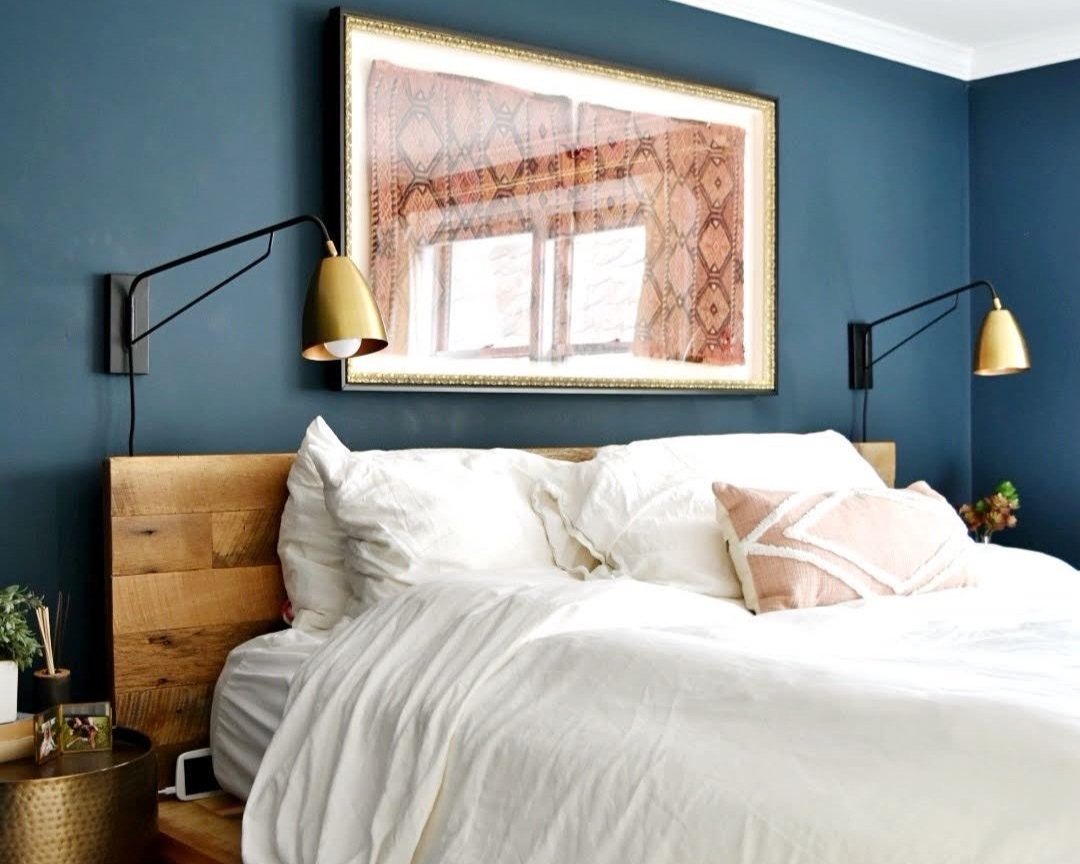
Extra White is a paint I've used both for many rooms of my own and for many clients. It's a true white paint, with minimal undertones. I love a bright, white room, and Extra White helps you achieve that.HAGUE BLUE BY FARROW & BALL:
Hague Blue is a fan favorite for a reason. With deep blue tones and a rich appearance, Hague Blue transforms any basic room into an absolute oasis. I always recommend it for clients who want to go bold.pro tip: don't forget you can color match higher-budget paints like farrow & ball for a less expensive brand.
What are your favorite paint colors? Do you like to go neutral or bold? Don’t forget to tag us on Instagram if our advice helps you transform your space!
xoxo, Taylor